iPhone Mini Sales Performance Dashboard w/ Power BI
This outlines the process of developing a multi-page Power BI dashboard to analyze the iPhone Mini product line’s performance relative to Apple’s broader iPhone portfolio.
The goal was to help executives answer a fundamental question: “Is it worth continuing the iPhone Mini line?” The dashboard balances high-level KPIs with the ability to compare across product lines, drill into time trends, and examine product attributes such as color, storage, and geography.
Note: The dataset used in this project was generated using Python's faker library, as the real data cannot be disclosed :)
Understanding the Business Problem
The iPhone Mini was introduced to target consumers who wanted flagship features in a smaller form factor. But market speculation suggested weak demand and cannibalization from larger iPhones.
The business questions I set out to answer included:
- Performance in isolation: How are Mini sales, revenue, and profitability trending?
- Comparative context: How does Mini stack up against Regular, Pro, and Max lines?
- Diagnostics: Where (regions, retailers, SKUs) does the Mini perform best or worst, and why?
The Data Model
The dashboard was built on a star schema:
- Fact table (Sales): revenue, profit, COGS, units sold
- Dimensions: date (with flags for year, quarter, season), region (country, market, subregion), product (line, name, release year, storage capacity, color), retailer (tier and type)
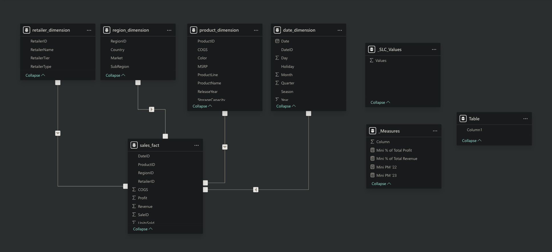
This model allowed me to slice performance by time, geography, and product attributes without redundancy.
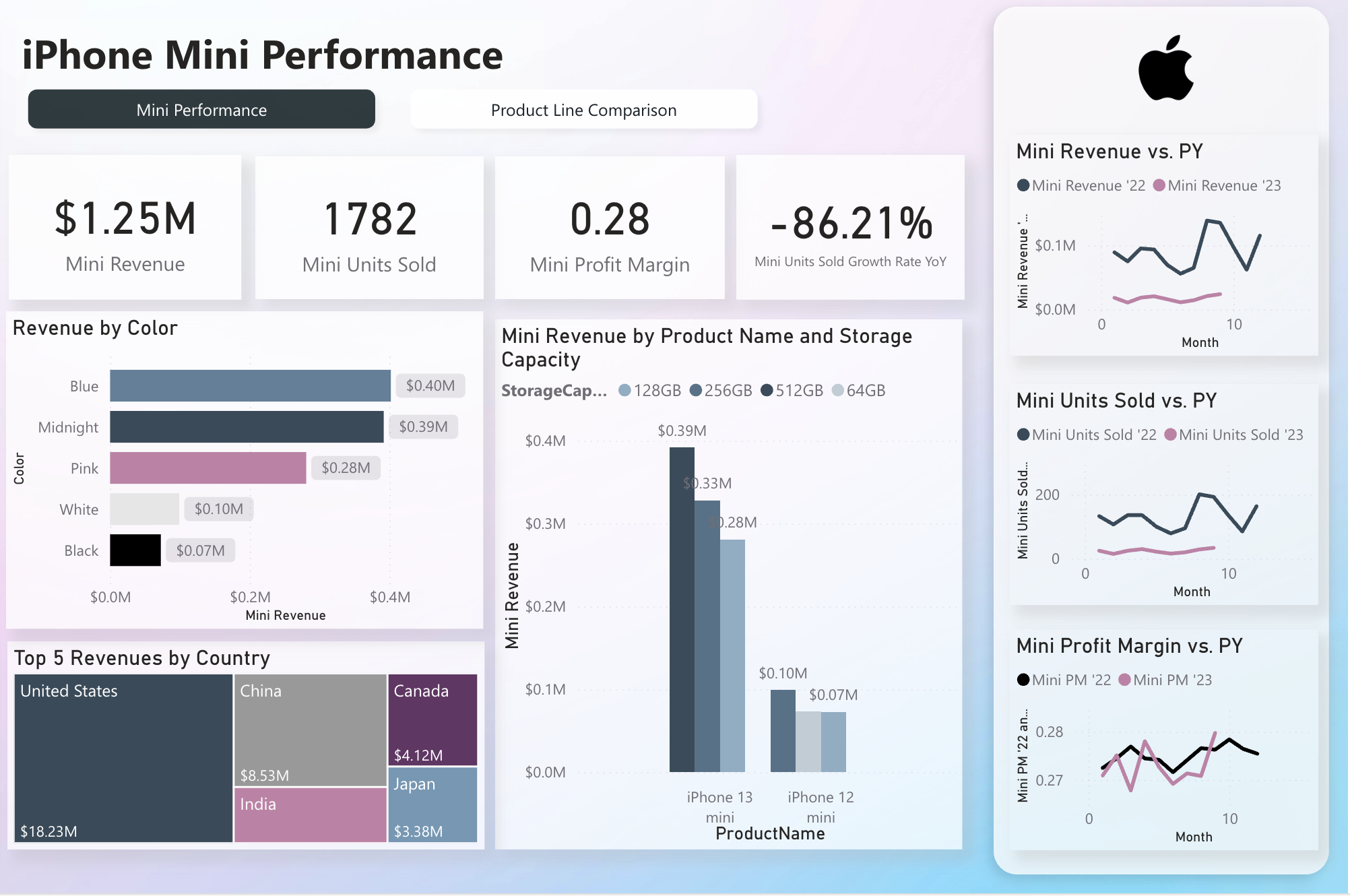
Page 1: Mini Performance
This page focuses exclusively on the iPhone Mini line, answering: “How is Mini performing in absolute terms?”
- KPI Cards: Revenue, Units Sold, Profit Margin, and YoY Units Growth (with conditional formatting to quickly flag declines).
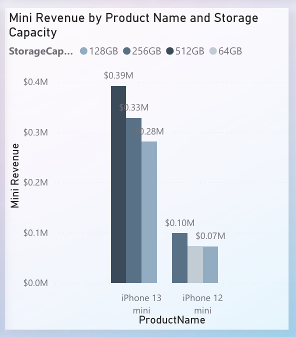
- Bar Chart – Revenue by Model & Storage: Breaks out iPhone 12 Mini vs. iPhone 13 Mini across storage capacities (64GB, 128GB, etc.), highlighting SKU-level variation.
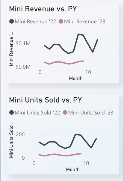
- Comparative Time Cards: Side-by-side visualizations showing Revenue, Units, and Profit Margin for 2022 vs 2023. This makes performance decline visible at a glance.
- Revenue by Color: A simple bar showing revenue split across device colors (Blue, Midnight, Pink, etc.), helping identify whether product mix drives demand differences.
- Top 5 Countries by Revenue: Focuses on geography without cluttering with a full map. Useful for spotting concentration (e.g., US and China leading).
This page establishes the raw health check: revenue is shrinking, profit margins are stable but weak compared to other lines, and YoY growth is heavily negative.
Page 2: Product Line Comparison
The second page shifts to benchmarking: “How does the Mini compare against other iPhone product lines?”
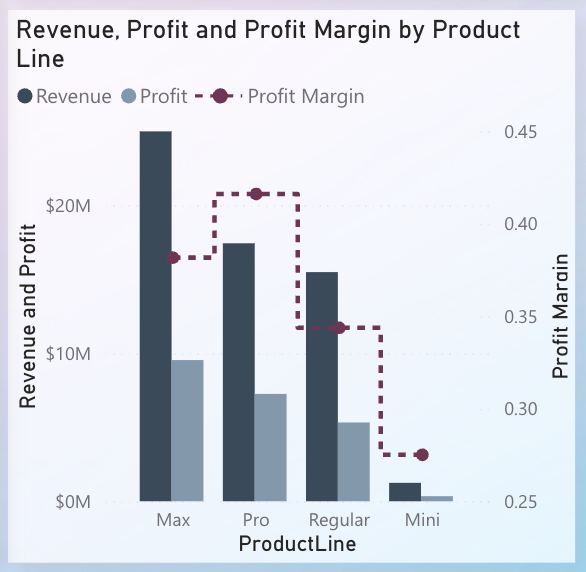
- Clustered Bar + Dot Chart: Bars show revenue & profit for each product line (Max, Pro, Regular, Mini), while dots overlay margin % for each line on a secondary axis. This avoids scale confusion and highlights how Mini underperforms both in scale and margin.
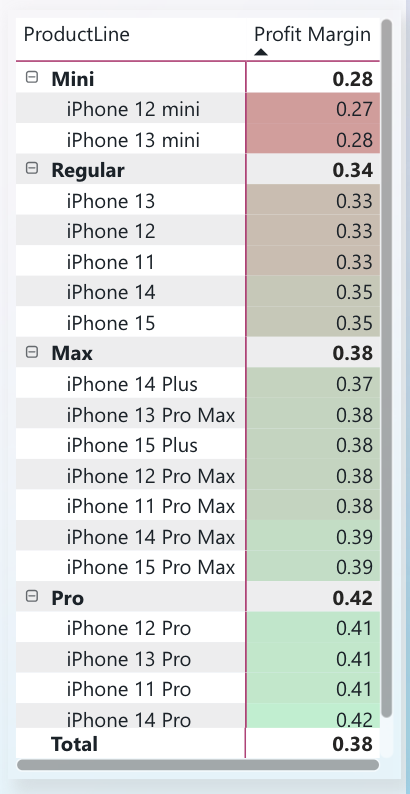
- Matrix of Models by Margin: A narrow tabular reference showing margin % across all SKUs. Conditional formatting makes Mini’s consistently lower values stand out.
- Line Chart – Margin Trends by Product Line: Compares Mini vs Pro/Max/Regular margin over 2022–2023, emphasizing that Mini’s margins are stagnant while Pro/Max improved.
- Pie/Stacked Bar – Revenue Share: Shows Mini’s share of total iPhone revenue (<2%). Even if margins were strong, such a small slice indicates limited business impact.
This page contextualizes Mini’s role as a niche contributor with weak comparative economics, answering the question “is it pulling its weight in the lineup?”
Features & Design Choices
- Trifold Layout: Filters on the left (year, region, retailer), detailed tables on the right, and main visuals in the center. This balance kept the dashboard compact but navigable.
- Conditional Formatting: Used to flag YoY declines and margin underperformance.
- Consistent Filters: Both pages share slicers, allowing apples-to-apples comparisons between Mini and overall lines.
- Dynamic Highlighting: Mini’s bars and dots are persistently colored pink to draw the eye against muted grays for other lines.
Business Insights & Applications
From the dashboard, executives could immediately conclude:
- Mini represents <2% of revenue and profit, confirming its minor role in the lineup.
- Margins are flat and lagging compared to Pro and Max lines.
- YoY units growth for Mini is –86%, suggesting declining consumer interest.
- Geographic breakdown shows reliance on a few markets, limiting expansion potential.
This supports the hypothesis that continuing the Mini line has low strategic payoff, unless a specific niche positioning justifies its existence.
Takeaways
This project demonstrates how a clean, multi-page Power BI dashboard can translate raw sales data into an executive-ready narrative:
- Page 1: “How is the Mini doing on its own?”
- Page 2: “How does it stack against the rest?”
By structuring the analysis this way, stakeholders can move from pulse → comparison → decision, with clarity at every step.