Interact with the dashboard on Power BI here!
In this post, I'll walk through my process of developing a comprehensive sales performance dashboard for fictitious nursery store Plant Co. using Power BI.
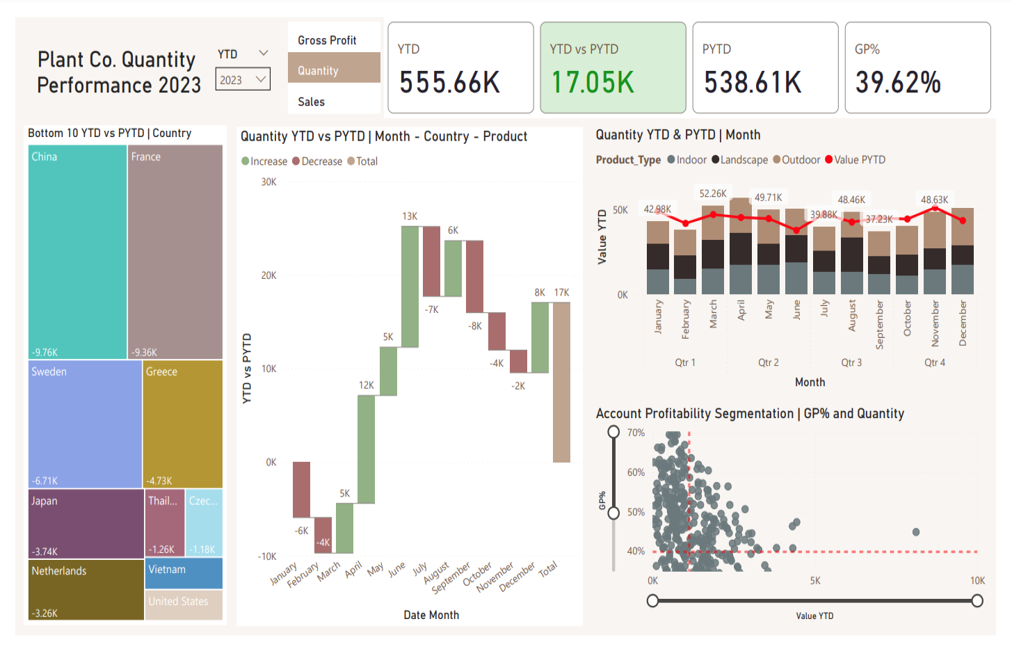
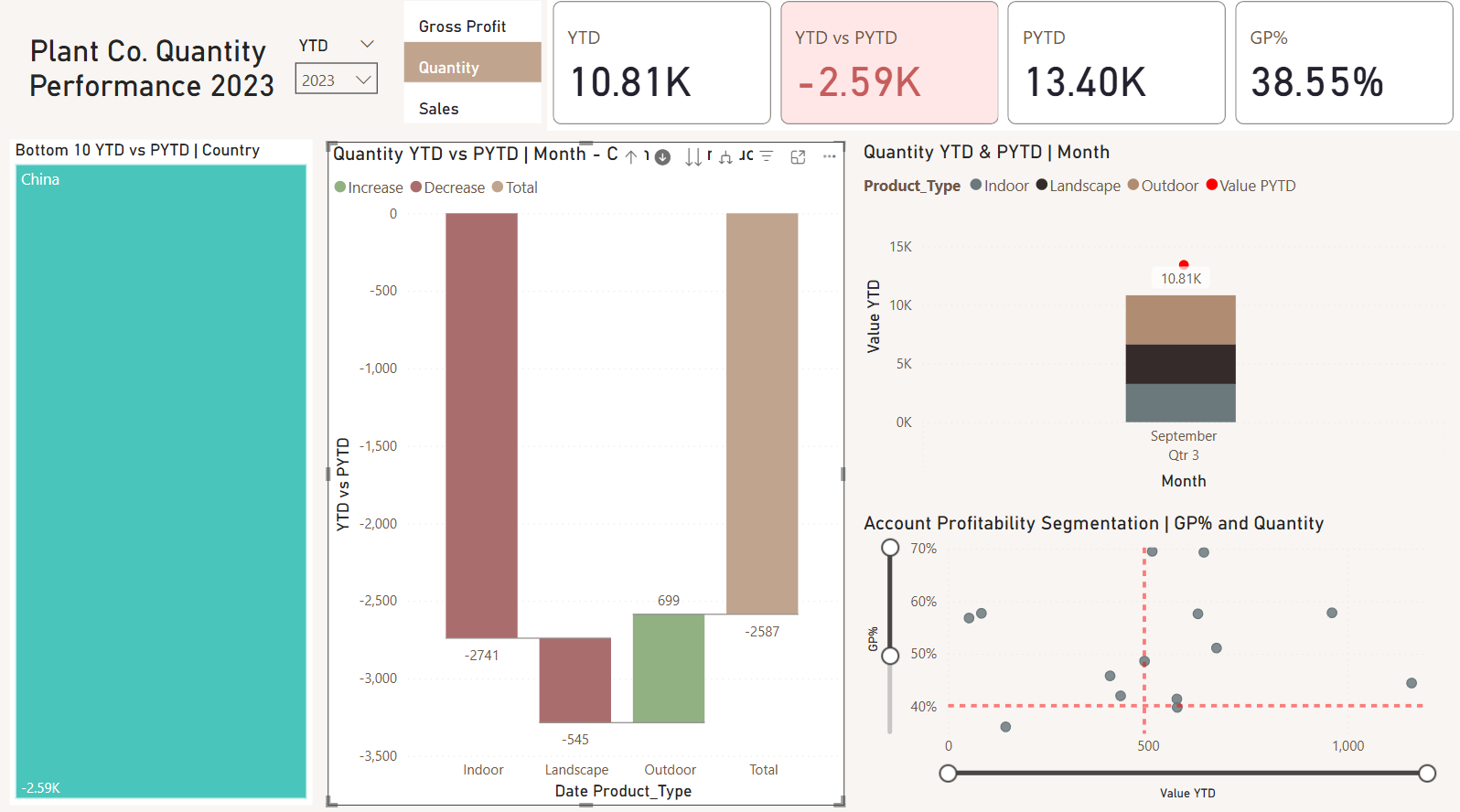
The goal was to build an interactive dashboard that would allow Plant Co. executives to track product quantity performance across different countries and time periods. The dashboard needed to provide both high-level KPIs and the ability to drill down into specific areas of concern.
Understanding the Data
The project began with an Excel file containing four primary tables:
- Products (information about plant product families, types, and groups)
- Dates (calendar information with flags for time periods)
- Accounts (customer information including location data)
- Sales Facts (transaction data including quantities sold, prices, and costs)
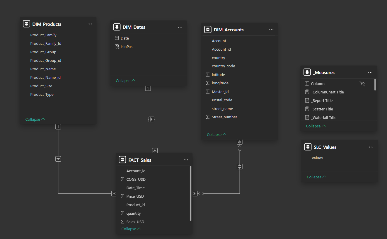
The initial data exploration revealed a classic star schema opportunity, with the Sales Facts table at the center connected to the three dimension tables.
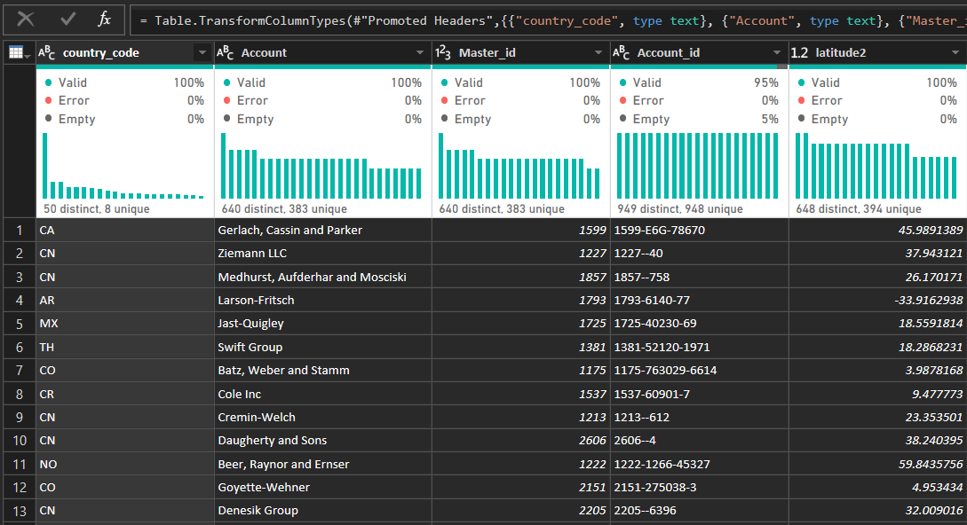
Data Transformation in Power Query
Before building visualizations, I performed several data transformation steps using Power Query:
- Cleaned column names for consistency across all tables
- Validated data types (especially for numeric fields like quantity and price)
- Created calculated columns where needed (e.g., profit calculations)
- Handled null values in key fields to ensure data integrity
Building the Data Model
The data modeling phase was critical for setting up useful visualizations in the next step. I:
- Established relationships between the fact and dimension tables
- Created hierarchies for products and geography to enable drill-down analysis
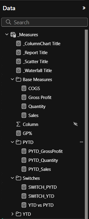
- Developed key measures using DAX:
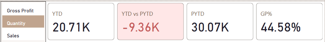
- YTD (Year-to-Date) quantity
- PYTD (Previous Year-to-Date) quantity
- Growth percentage calculations
Core Visualizations and Measures
The dashboard development focused on answering key business questions:
1. How is quantity performance trending this year compared to last?
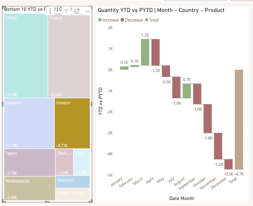
2. Which countries are underperforming?
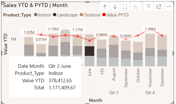
3. How are different product types performing across the year?
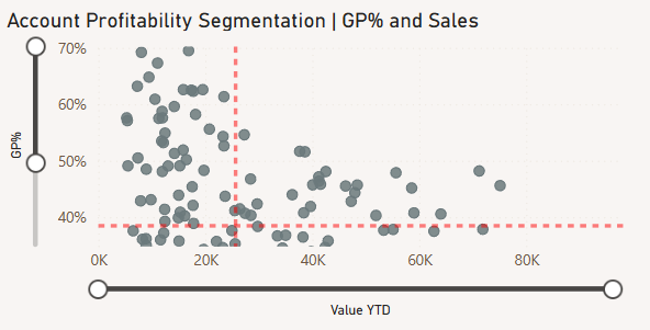
4. What's the relationship between quantity and profitability?
Advanced Formatting and Interactivity
To make the dashboard more usable and visually appealing:
- Applied conditional formatting to highlight positive/negative performance
- Created dynamic chart titles that update based on selections
- Implemented consistent color schemes across visualizations
- Added interactive elements like slicers and drill-through capabilities
The color scheme was carefully chosen to ensure accessibility while clearly indicating performance status (green for positive, red for negative).
What Are This Dashboard's Applications in Business and KPI Tracking?
For plant retailers and wholesalers, these insights translate directly to actionable strategies:
- Market-Specific Interventions: The country-level analysis enables targeted interventions in underperforming regions, potentially through promotional campaigns, pricing adjustments, or distribution channel optimization.
- Inventory Planning: With clear visibility into monthly performance by product type, companies can optimize inventory levels to match seasonal demand patterns, reducing both stockouts and excess inventory costs.
- Profitability Management: The GP% vs Quantity analysis helps identify accounts that may be receiving excessive discounts or those with unfavorable cost structures, allowing for targeted margin improvement initiatives.
- Product Development Focus: Understanding which product categories perform best in which seasons and regions can inform product development and marketing efforts.
By continuously tracking these KPIs through the dashboard, management can quickly identify deviations from targets and implement corrective actions before issues significantly impact the bottom line!